Practitioner’s Guide for use of Data Visualisation and Infographics
Reference No:202/9/PPG-2015 Dated:20 May 2016
1. Objective of the Guide
This document aims to provide guidance on use of data visualisation or infographics to represent data and information for enhancing the quality of reporting and presenting in various documents prepared in the Indian Audit & Accounts Department.
The terms “Data visualisation” and “infographics” are used synonymously and interchangeably to describe the presentation of data or information through graphics or visual means. Infographics have an intrinsic feature of emphatically communicating complex relationships between various sets of data and information, which can be leveraged while reporting so that Audit Reports and other audit and account products become lucid, more understandable to a wider range of stakeholders while not compromising on depth of analysis. While infographics are a very good media for effective communication and have significant advantages, their incorrect usage could lead to misrepresentation of information leading the reader to draw wrong and unintended conclusions.
This guide discusses the characteristics of data visualisation/ infographics and enunciates the principles for usage of appropriate techniques in various documents prepared by the Department. This in no case means a complete substitution or replacement of text with graphs and diagrams. Effective reporting would involve a judicious mix of text, tables, graphs and charts and other diagrams in relation to the subject matter being reported upon and infographics are intended to complement the textual content. Professional judgement should be exercised while opting for the prudent combination of infographics.
This guide carries examples which are directly applicable to reporting of audit results, however, the principles apply equally to accounts presentation.
2. Essentials of Reporting
On completion of each audit assignment, the auditor should prepare a written report setting out the audit observations and conclusions in an appropriate form; its content should be easy to understand, free from ambiguity and supported by sufficient, competent and relevant audit evidence and be independent, objective, fair, complete , accurate, constructive and concise (Para no 7.1 of Performance Auditing Guidelines).
Auditors should prepare a report based on the principles of completeness, objectivity, timeliness and contradictory process. (Para no 2.19 of Compliance Auditing Guidelines).
Significant irregularities noticed during audit of finance accounts and appropriation accounts should be presented as audit findings along with an analysis of underlying causes and their impact. (Para 4.15 of Financial Attest Auditing Guidelines for audit of State Government Accounts)
3. Data visualisation in Reporting
Data visualisation plays a crucial role in aiding objective, complete, concise and constructive reporting as visual techniques very effectively convey intricate patterns, trends, correlations between variables in the information in a manner that enhances the comprehension of the intended users. It promotes better appreciation of the audit findings and conclusions and addresses the growing needs and expectations of a wider range of interested stakeholders. It can also assist in presenting financial and accounting information in a more comprehensible fashion.
Easy to use tools and applications for data visualising and preparing infographics are available that can enhance the accountant’s and auditor’s access and ability to leverage visual techniques for analytics and reporting. The three basic elements for data visualisation are:
• objects (the data points)
• values (also called attributes) and;
• relations
Objectives of Data Visualisation
Data visualisation aim at achieving one or more of the following objectives:
• Comprehensibility: makes information and relationships easily understandable
• Comprehensiveness: presents features/information for the entire selected data set/sample size as against selective reporting
• Focussed communication: facilitates concise and ‘to the point’ communication
• Reducing complexity: simplifying the presentation of large amounts of data
• Establishing patterns and relationships: enables identification of patterns and relationships in the data
• Analysis: promotes thinking on ‘substance’ rather than on ‘methodology’. It focusses on the essence of the finding being communicated rather than on the procedure for communication.
4. Principles for using data visualisation
The principles that should be followed while using data visualisation are as under:
a) Relevance - Must fit to purpose
The first principle of any visual representation, be it graphs, charts, maps, organograms, process flow diagrams or even pictures, is that it MUST confirm to the purpose for which it is being used. In the context of audit reports it means the visual presentations should confirm or contribute to concluding against at least one of the objectives. In case of presenting financial information in case of accounts, it should relate to the theme under discussion or analysis. The visual matter, therefore, must portray a broad theme being pursued and ideally should not contain more than two sub themes.
b) Functionality - Must help enhance content
Even while the representation through visual means fit one or more of the objectives its utility must be further tested to assess whether it enhances the readability or content of the report. Visual representation should not be a means to merely demonstrate the facts/components of the subject matter but should aim to throw up the audit finding or the cause effect relationship of the sets of data. If an explicit message is not emerging from the infographic, a table would probably suffice to present the data.
c) Simplicity and User friendliness - Must be designed keeping the reader in view
The infographic needs to be designed in a manner that is self-explanatory so that the reader does not have to read the main text to understand them. The design should be simple, allowing the reader to view the numbers, trends and relationships of the data by minimising embellishments on tables and graphs.
The title and labels of the infographic should be concise and the visualisation should be organised in a manner that the point is obvious. The title should reinforce the message of the infographic.
The infographic should not be over-complicated by attempting to show two or more disparate sets of information. Additionally, distortions such as 3-dimensional graphics and unusual formats such as spider graph, cluttered backgrounds, gridlines, multiple fonts, borders, bold and underlines need to be avoided as they distract the user from the infograph’s message.
d) Must balance ‘form’ and ‘function’
An ideal infographic should clearly communicate information as well as stimulate the engagement and attention of the user. Therefore usage of infographs should seek to achieve a judicious balance between form and functionality. Elegance and sophistications in infographics are as critical as the purpose and accurate presentation of information since they enhance the visual appeal of the infographs. Appropriate choice of infographs enriched by suitable colour combinations to depict varying range of performance/deficiencies supports easy comprehension of the intended message. The traffic signal solution may be used to portray ranges of performance - red colour to depict poor performance, amber/yellow to indicate average performance and green to describe good/very good performance.
5. Guidance on the Choice of Infographic
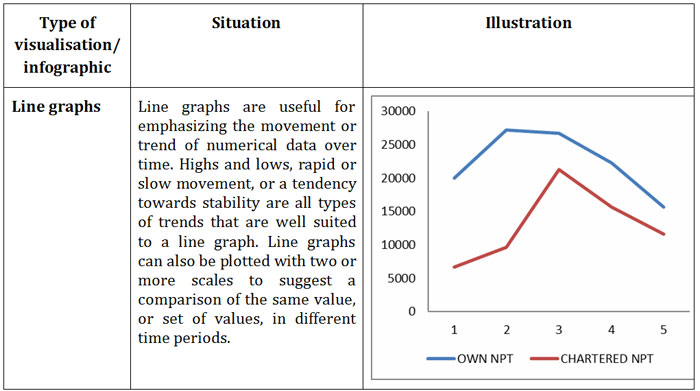
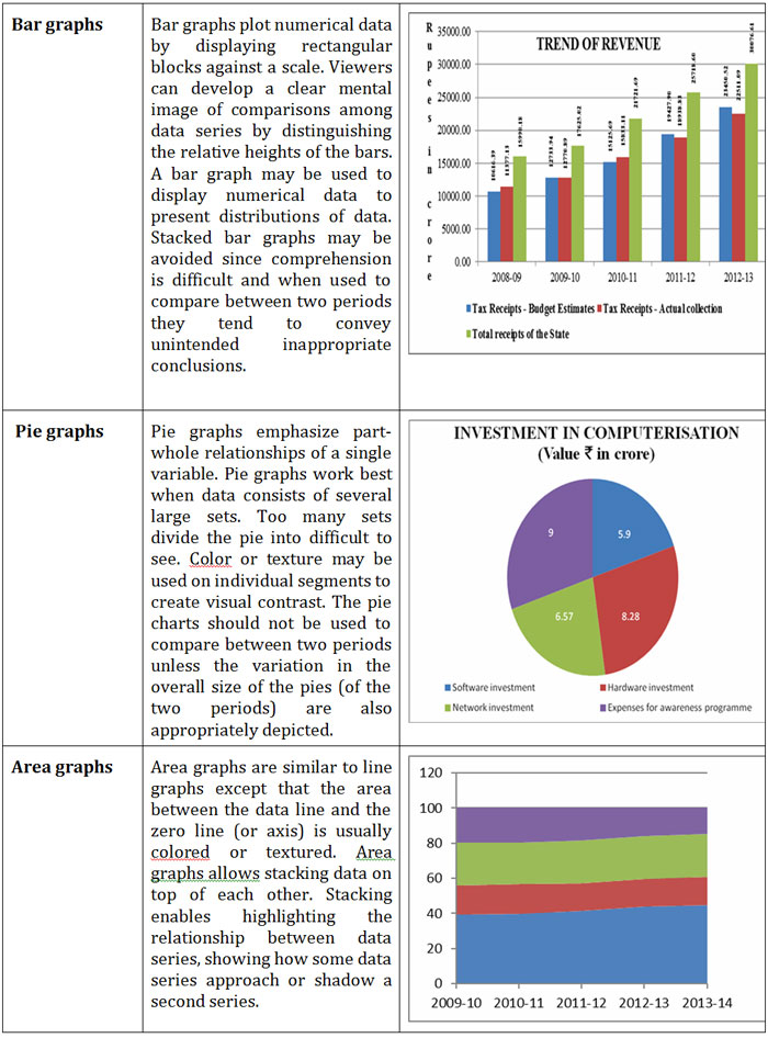
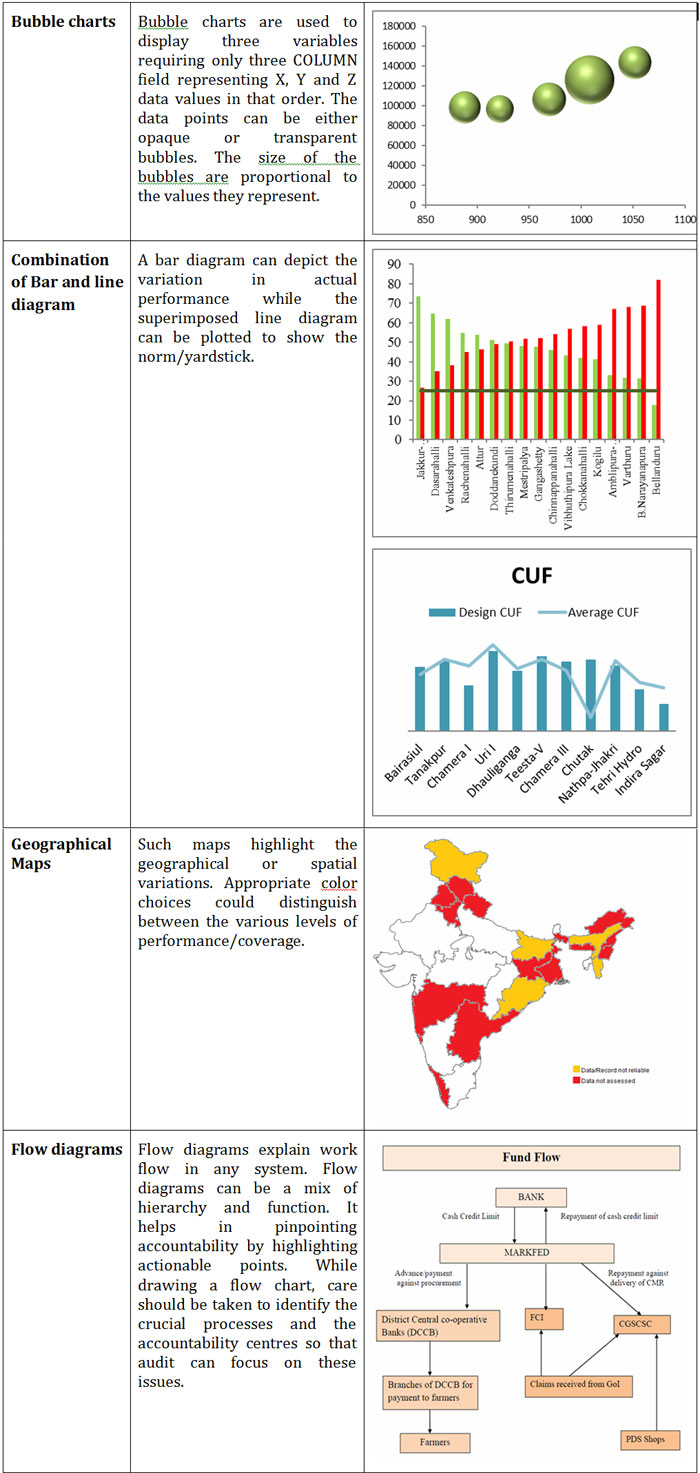
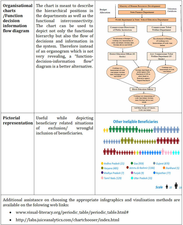
There are numerous types of infographics to present trends and relationships, such as changes over time, correlations, and frequency distributions and their usage depends upon the context and the subject matter that is being reviewed and presented in reports. While all audit situations cannot be perceived, it is possible to lay down broad generalisations of the types of infographs, based on their attributes to best address the situations commonly encountered by auditors.
The following table provides an illustrative set of infographs that can aid us in opting for appropriate infographs, which can be used in Audit Reports, financial reports and other products with suitable modifications to address specific situations and contexts.
6. Conclusion
Data visualisation therefore enhances the quality of reporting both in terms of the substance as also the form and promotes better understanding and appreciation of audit findings. The generic principles and illustrative usage have been set out in this practitioner’s guide is intended to serve as a baseline guidance. Some practical illustrations have been tried out and these initial attempts of data visualisation, including interactive data visualisation have been demonstrated in the third and fourth editions of e-journal (Journal of Government Audit and Accounts) available on our website. The domain of data visualisation is, however, wide ranging and can be imaginatively exploited to suit diverse reporting and presentation contexts. Increased use of data visualisation is envisaged in our Department and field offices are therefore encouraged to leverage the full potential of data visualisation in Audit Reports, financial reports and other products. Field offices could also explore using interactive data visualisation while disseminating abridged versions of reports and products on the electronic media.
Continue Reading |
-

From the Editor's Desk
This issue of the journal is the first issue with a thematic approach of “Capacity Building”. It will be our endeavour to continue this approach in future
...more
-

Capacity Building in IA&AD
Mission statement of IA&AD eloquently states “Mandated by the Constitution of India
...more
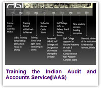
Training the Indian Audit and Accounts Service(IAAS)
The Officer Trainees (OTs) entering the Indian Audit and Accounts Service(IAAS)
...more
-

Training for Environment Audit - iCED, Jaipur
iCED also contributes to build capacity of other Supreme Audit
...more
|
-

Knowledge Sharing Activities of SAI India
Comptroller and Auditor General of India(SAI India) is acknowledged as a leading
...more
-

Induction Training from OTs’ Perspective
Journey from a civil services aspirant to a successful candidate and further to a
...more
-

Regional Training Institute, Kolkata
In pursuit of excellence
Regional Training Institute, Kolkata was set up in April 1998 as Regional Training Centre.
...more
-

From International Desk
The CAG of India occupies several important positions in INTOSAI and ASOSAI.
...more
|
|
|
|
|